Showing posts with label illustrations. Show all posts

Saturday, September 04, 2010

Box Art - Panzer Dragoon in USA and Japan


One of the key reasons - out of many - the Sega Saturn failed in the West was because of the hideous box designs and illustrations.  In America, Sega used their hideously large plastic Sega CD boxes
, which must have been a serious challenge for the designers and illustrators.  Legend has it that this decision was made because the company manufactured so many Sega CD cases, expecting that peripheral to become a smashing success.  Obviously, that didn't happen.

The cover designs for the early Saturn games followed the aesthetic of Sega's other consoles at the time, with the system named in large letters on the side.  This was never a good decision, and I was never a fan of the red Genesis boxes.  I much prefer the older design, with the black grid and Genesis logo, laid over a VHS box.  At least those games could fit into your media library comfortably.  The Sega CD and Saturn cases just stood out.

Do I really need to say anything about the cover illustration for Panzer Dragoon?  Of course not.  It was terrible in 1995 and it's terrible today.  To me, this says, "rush job," and that probably was the truth.  Remember that Sega of America rushed Saturn to market several months early, in a desperate bid to stop the building momentum for Sony's Playstation, which at the time had ALL the buzz.  Playstation was the hot new thing and all game players knew it.  And Sega was burning its reputation into the ground with all those crummy machines.  32X felt like a mugging.  Yuck.


 Now let's look at the Japanese cover for Panzer Dragoon, and it's wonderful.  Notice that Sega Japan used CD cases, which would soon become the industry standard.  It's far more economical and compact, it fits on your shelf perfectly, and allows illustrators more freedom to create.

This cover was drawn by famed French artist Moebius, whose work was a great influence on Panzer Dragoon.  You can see his influence on all three PD games on the Saturn.  This is a rich world, full of mysteries and secrets that the games themselves only reveal in small pieces.  You can see the vast potential for future games without ever running out of ideas.  It's a shame that Team Andromeda is no longer around.  Sega gave the series to their Smilebit studio for Panzer Dragoon Orta on Xbox, but it really wasn't the same experience.  I know I'd rather play the older, chunkier Saturn titles instead.

The Japanese PD cover is brilliant.  I want to explore this world.  Even if I know nothing about the game itself, I'm interested.  A skillful cover design can be a hook in itself.  Too many publishers don't seem to understand this, and the result are many video games that fail miserably at retail.  Who in their right mind doesn't want a kick-ass album cover?

Monday, June 14, 2010

Atari Box Art - Star Ship


One of the original 1977 launch games for the Atari 2600 VCS, Star Ship quickly faded and disappeared, but I always thought it was a pretty good game.  The lunar lander game, especially, kept me entertained as a kid.  Of course, it can't hold a candle to the Atari arcade game, Starship 1, which features spectacular scaling effects.  That's probably why this title was pushed aside.  Oh, well.  At least the illustration is fantastic, and you can't take that away.  Why can't games today look like this?

Atari Box Art - Star Raiders


I'm a great fan of Atari's illustrations for their video and computer games from their golden age.  I really wish Atari Interactive or the original artists would sell poster-sized prints, because this is some spectacular artwork.

And Star Raiders....wow....Star Raiders.  It's impossible to explain to a younger generation just how astounding and groundbreaking this was when it was released.  It was the greatest and most sophisticated video game ever made, far more complex and rich than anything we had ever seen.  It's almost enough to make me want to hunt down an Atari 800 computer from Ebay to play the cartridge again.

Tuesday, February 02, 2010

Barrel Pong


Wow! This is now officially the coolest video arcade game ever. This is an actual cabinet for Atari's Pong in 1972, dubbed Barrel Pong. Oh, how I wish I could find this on Ebay. Just marvel at this ancient flier....This young woman is now somebody's grandma. Time flies fast, kids.

Wednesday, November 11, 2009

Poster - R-Type


Here is the original Japanese arcade poster Irem's R-Type.  R-Type is unquestionably the most influential side-scrolling shoot-em-up ever made (Gradius would be number two).  Every arcade and console shooter for the next decade looted and pillaged freely.  Some stole a little.  Some stole a lot.  But in the minds of hardcore shooter fans, Irem's original remains the king.

The best games managed to build upon Irem's original ideas and move the genre forward.  The best example would probably be the TOZ unit in Telenet's Gaiares on Sega Genesis.  The TOZ unit could be fired on enemy ships, where it would steal its weapons like a virus.  Your own ship was barely armed with a pea shooter, so strategically stealing the correct weapon for each scenario was key.

This is a terrific poster for a classic videogame.  The H.R. Giger designs continue to stand out, and the art direction is superb.  And R-Type is a tough game, damned hard.  Games in the '80s were really hard, weren't they?

Tuesday, November 10, 2009

M.U.L.E. - The Gatefold Album


Way back when Electronic Arts began as a software company for home computers in the 1980s, floppy discs were the standard storage medium.  They resembled small records, so EA, in a fit of brilliance, packaged their games in gatefold albums.  The goal was to present their game designers as artists, as creators in a new medium.

Since I was going to reprint my 2003 MULE review here on Videogames of the DAMNED, I thought I should show the game's terrific album cover.  It's really quite impressive.  The four men of Ozark Softscape - Dan Bunten, Bill Bunten, Jim Rushing, and Alan Watson - are not shown as computer nerds hunched over mysterious machines.  They're portrayed as rock stars, as cool.  The "electronic artist" was a pioneer in this new, futuristic medium, and they were going to get all the perks of celebrity stardom.

That sort of recognition has always been a goal - and a source of frustration - for game designers ever since the Atari era.  Even in 2009, there are only a small handful of "names," and you almost never see any names on the boxes.  Development teams are immensely large today, hundreds of workers for a single big-budget project.  The artists have become swallowed by the machine they created.

I think the rise of digital distribution and the growing indie game scene may be a successful route for the artists.  If it is still possible for a small team to create a great video game, then a future of "electonic artists" may yet become reality.

I'd like to see indie game designers pursue this dream of the designer-as-pop-star.  I'd like to see what you could do with that in the iPod era.  If you want games to be seen as art - low or high art, it doesn't matter - then you're going to need recognizable artists.  You have to create something that isn't mere product, but something valuable, something that brings people together.

MULE brings people together, young and old, children and grandparents, casual and hardcore gamers alike.  It really is the greatest multiplayer game ever made, and you can see that creative, communal spirit on the MULE album cover.


Friday, October 23, 2009

Marcee's Halloween Hairstyle


Now I have to get myself a pin-striped suit and get a haircut. We'd look just like The Addams Family. Heh heh. See, this is why I think long hair works best for Marcee. It's her style.

Marcee works for a construction company; she handles public relations, payroll, and regularly visits the building sites. Occasionally, she runs the business while the boss is away. Our goal is to find a similar employer in Boston who would be willing to bring her over. I have to get a spreadsheet program for my computer so we can work on updating the resumes, then start hustling for that elusive Boston job.

Wednesday, October 14, 2009

Helloo Marcee!


I'm showing off a photo of Marcee because I want to see her shining face while I'm at work during the day. These are very artsy photographs. I love 'em. But, as you can guess, I'm biased. Heh heh.

Sunday, October 14, 2007

Classic Videogame Illustrations #7


The Japanese art flyer for World Heroes 2 Jet. An impressive little bit of anime-styled artwork for the sadly underrated fighting game series. C'mon, this game has a crazy medicine man. It has a pirate! What more do you want?

Sunday, September 09, 2007

Classic Videogame Illustrations #6

Courtesy of Vintage Computing and Gaming, comes this box art for a Commodore 64 game. Good lord, this one's weird. Really weird. I've never heard of frog master before; I wonder if it's really a football game. And if so, why is it called "Frog Master," anyway? Although, now that I think of it, frog football could be pretty good. Yeah, right. This is just too freakin' weird.

See, parents of America? Videogames aren't harmful at all. Because of this, little Timmy and Suzy didn't have to drop acid. The football frogs came to them.

Wednesday, July 04, 2007

Contra 4 Poster


Word got out quickly about this one. Nintendo Power included a groovy cool foldout poster for the upcoming Contra 4, which hit stands around the same time as the first gameplay movies. If those movies didn't grab your attention, this poster surely will.

Clearly the developers (not Konami, but an American development house) is aiming for that retro NES feel. Smart move. Very smart move. The Contra brand hasn't meant anything in over a decade, really. This back-to-roots sequel just might change all that.

Oh, and look! Some gameplay videos of Contra 4 in action. Dual-screen play like the original arcade, but gameplay and pacing clearly patterned after the NES classic, with nods to Super C, Contra 3, and even Bionic Commando. I'm usually skeptical of these retro comebacks, especially when performed by outside studios, but this time I'm genuinely hooked. Let's cross our fingers and hope it turns out right.


Wednesday, January 17, 2007

Classic Videogame Illustrations #5

The box art for Xevious, Atari 7800. Would be nice to find some of the classic Atari artwork without the boxes or logos, but what can ya do?

Monday, January 08, 2007

Classic Videogame Illustrations #4


The American arcade flyer for Donkey Kong, Junior, circa 1981. I was never really a fan of the game, but there's no denying that the artwork is terrific. A lot of the best videogame illustrations come from this period, when graphics were still too abstract and blocky to really stand on their own. You needed to provide your own imagination to fill the gap, and suspend disbelief.

Here, the Nintendo characters like Mario and Donkey Kong hadn't been canonized yet, so you still have that American, Popeye inflence, instead of the Yoichi Kotabe designs from Japan.

Oh, that reminds me. One of these days, someone is going to have to explain to me why Kotabe retired from animation and went to Nintendo, of all places. I don't have a clue how someone goes from Horus and Heidi to illustrations for Mario and Zelda. It's all so...weird.

Monday, October 02, 2006

Classic Videogame Illustrations #3

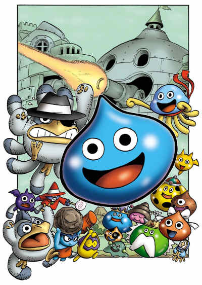
Seriously, how can you not dig a game like this? This is Square-Enix's new Dragon Quest Heroes: Rocket Slime for Nintendo DS. It has jellybean tank battles. What more do you want?

Seriously, you should check out Rocket Slime. It's a great little game, just weird enough to fit in with all the other weird DS titles.

Saturday, September 23, 2006

Classic Videogame Illustrations #2


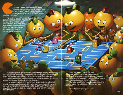
This is the illustration for Pac-Man on the Atari 400/800 computers in 1982. It's a little different from the Pac-Man that you're used to seeing, eh? It's a very Americanized version, even down to the Pac shirt. Atari was known for its vivid, imaginitive game illustrations; this was somewhat necessary due to the primitive graphics of the time, but great artwork nontheless.

This second illustration is from the instruction book. It essentially is the instruction book. It's another great example of being aware that this is only a simple videogame, a collection of abstract symbols. It's an iconic style. Of course, today we could easily render the cartoon graphic-style as shown in these illustration. But answer me this: would Pac-Man retain its iconic power? Would it really look as good? Would it have captured people's imagination the same way?

It's a good question to consider in this endless rush for prettier graphics and greater detail.

Friday, September 22, 2006

Classic Videogame Illustrations #1


While doing some editing at Wikipedia, I came across this illustration for Sonic the Hedgehog. I've always like the American artwork over the Japanese version (which, frankly, was just weird; I don't think Sega Japan ever really "got" Sonic), and seeing it again for the first time in ages, I'm struck at how great it really is.

As far as graphic designs go, this is just about as good as it gets. The whole essence of Sonic, from the sense of motion, of speed, of the slightly off-kilter checkerboard style, is present in this illustration. It's certainly the best Sonic illustration ever made, and probably among a handful of the all-time best.

Oh, and according to Wikipedia, Sonic fought in the Civil War, opened a chain of sandwich shops, trapped Bill Murray in an unending time-loop just for kicks, and made out with George Bush at the State of the Union speech.

Okay, that last one's Joe Lieberman. So maybe that one's wrong.