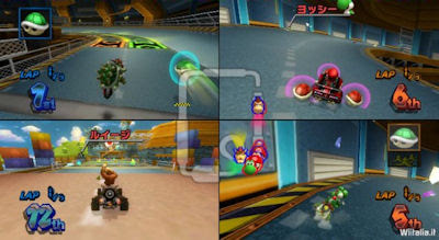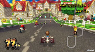


(Note: Again, Blogger is being a pain...photos soon...finally got the photos up!)
Mario Kart for the Wii is looking excellent, as expected. It's always nice to see these games near the end, after they've been given that extra coat of paint. I've only seen a couple gameplay clips, smuggled out of trade shows, but it looks to be as great as ever. The little steering wheel attachment looks pretty nice, too.
Notice that one screenshot with the globe. Am I wrong to guess this is how we'll be selecting opponents for online matches? An interesting idea, and continues the trend of making everything iconic, and away from all the messy text menus. Also, very smart move to use one big track icon for the multiplayer mode. More game real estate for the actual playing. I'm surprised this hadn't been thought of long ago.
So it seems that everything is shaping up....another great Wii game I'll never get to play. Seriously, is Nintendo just hoarding these consoles, or did they forget to make 'em? Maybe this should be part of Barack Obama's platform - a job for every household, and a Nintendo Wii in every home!
No comments:
Post a Comment