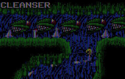

After writing about Slime World for the Genesis a few posts ago, I wanted to take a closer look at the differences from the Lynx original. Here are a pair of screenshots from each version.
One thing about the Lynx version, and this is really important, is how the game actually looks on the handheld. The Handy emulator includes a terrific "LCD" mode, which is how I took this screenshot. Yes, I am the master of videogame screenshots, thank you, thank you.
It's noticable how much darker the game looks through the LCD filter. For a lot of games, this could be a problem, but for a game like this, it's perfect. Atmosphere is just about the most crucial element of the game. It has to feel a little alien, a little spooky.
But here's another thing that I think is crucial, and it leads into the Genesis version. The graphics have a noir style, very heavily accented with shadows. You never see anything just below ground level.
This was a common technique in later NES games; Ninja Gaiden 2 and Batman are probably the best examples of this. That style of putting most of the screen into shadow was necessary; designers and artists were pushing the 8-bit Nintendo to its limits, trying to compete against the newer, more powerful Turbografx and Genesis. Later NES titles used MMC chips and other technolgies to keep the system viable.
For the most part, I think it was very effective. Not only did it get around the console's age, it gave us a visual style for games that, frankly, hasn't been since ever since. And I think that's very unfortunate.
Game designers have been pushing more colors and bigger, brighter worlds for the past decade, but too many games just look bland, washed out. Everyone has copied Mario's brightly-lilt, primary-colored worlds ever since the Super Nintendo. In a sense, you can't blame them. Production costs skyrocket every year, and the suits want to see that money on the screen. They want flash, bells and whistles, and the buying public seems to want it, too.
But I think this is a mistake. We confuse newer technology with "better" graphics, as though splashing more colors and more polygons on the screen makes a better videogame. I don't agree with that at all. I think the darker, noir style can be extremely effective. Has any Batman game looked as good as Sunsoft's NES version from 1990? Be honest.
The fog from the 32-bit generation was the '90s version of this. It was employed originally as a means of hiding the vanishing point, so you wouldn't see polygon pop-up. It also gave many games a sense of mystery and atmosphere. Silent Hill is a perfect example. Racing games were also better; because designers needed to avoid pop-up, they constructed winding, snaking tracks that were not only challenging, but truly exciting. Wipeout, anyone? Sega Rally?
Anyway, this all brings us back to the topic at hand, the question of why Slime World is so much better on Lynx than Genesis. I think M. Peter Engelbrite's heavy use of shadows is one key reason. It draws you in, forces you to look more closely, pay more attention.
Then the giant teeth snap out of the ground and give you a shock. You laugh at yourself for being started so easily, but five second later, you're jumping again. Remember, again, that this was years before the dog in the window from Resident Evil.
Has anyone ever been scared by the giant teeth in Genesis Slime World? I don't think so. It's never fazed me, not even once. When I came to realize that, I knew something was amiss. Something vital to the formula has been lost.
The other crucial difference, which ties into the first, is the sense of scale. In Lynx Slime World, everything is up close. On Genesis, everything is at a great distance. At least, to my mind, it feels like a great distance. I feel like I've been sent packing to the nosebleed seats. I don't know if the designers of the Genesis version had any other options, really. Perhaps this game is just better suited to handhelds.
No comments:
Post a Comment